Back to all work
Archive
1) Visualizing COVID-19 Beyond Counties
Roles: Data Visualization // Collaborators: Eric Buth
While most COVID-19 data is being reported at the county level, visualizing data at this level can be problematic. Counties accross the country have arbitrary geometries and can often misrepresent the actual numbers. This happens particularly in large rural counties that also have small urban areas.
Using Eric Buth's algorithm for disaggregating county-level data, I was able to make some map visualizations that represented COVID-19 cases in a more honest way.
To read more about the process, read this article.


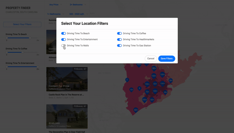
2) X: Distance Based Recommendations
Roles: Product Design, Front-End Development, Algorithm Design, and Data Visualization // Collaborators: Eric Buth, Mahir Yavuz
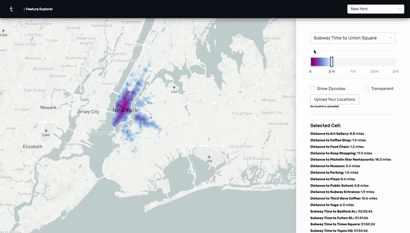
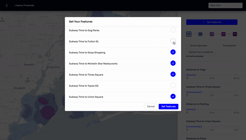
This was a prototype I designed and built using React, Deck.GL, and Google's S2 cell library. By calculating n^2 subway, drive, and walk travel time distances between hundreds of thousands of points in New York City and Charleston, I was able to make an app that visually highlights all the places that meet a certain set of distance criteria. For example, as a user, I would be able to find all the places in the city that are within a 20 minute subway ride from a public school, a 10 minute walk from a park, a 10 minute drive from my favorite restaurant, and a 15 minute subway ride from my job.

Using the same technologies, I built a version of this prototype for Residential Real Estate in Charleston. This version had an added recommendation algorithm that scored properties based on the number of distance criteria each one satisfied.
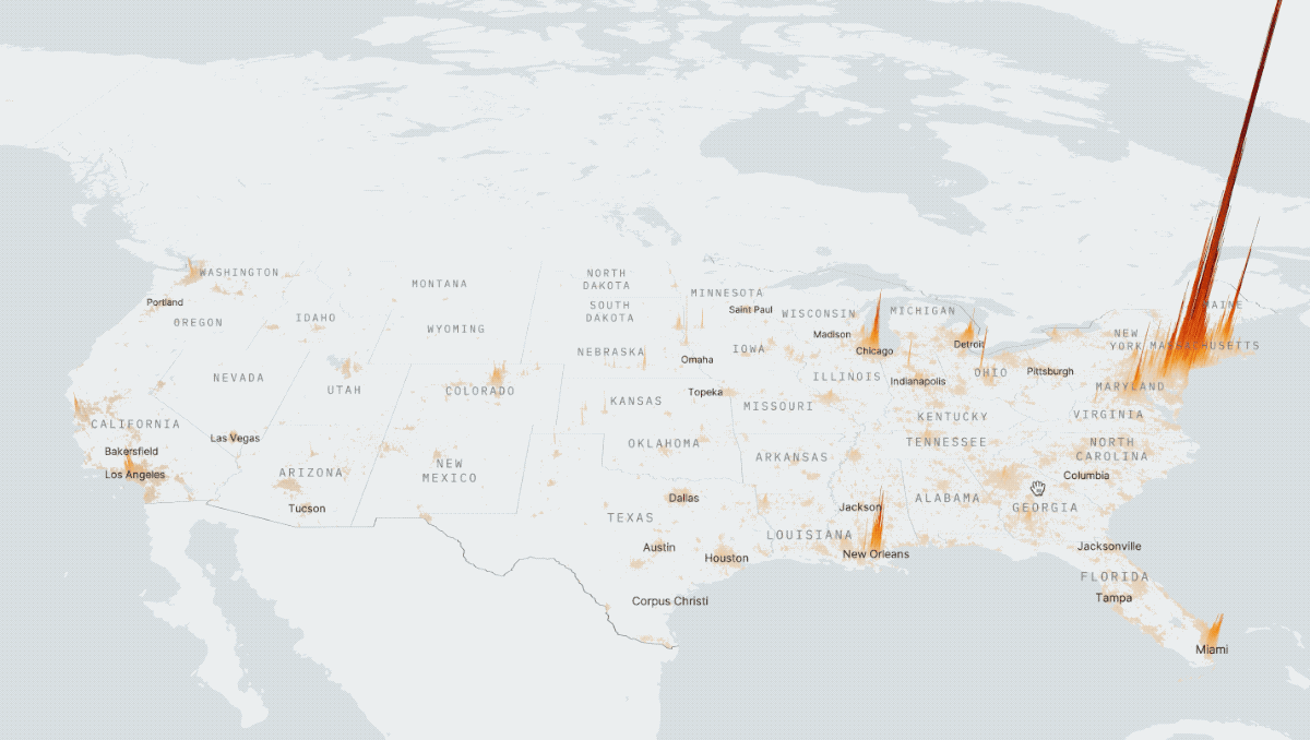
3) Adaptive S2 Cells
Roles: Algorithm Design // Collaborators: Eric Buth

When building FIT, my coworkers and I were discussing how to build a model that recommended the georaphic locations for where a brand should open up a new store based on it's previous site-selection patterns.
A first iteration of this model involved counting up all of the points of interest in the Census Block Groups in the US and generating a model that recommended CBGs to brands based on their brand composition. Gucci might be recommended CBGs with lots of high-end fashion and a local coffee shop might be recommended CBGs with lots of other local food options.
The main problem that we had with this initial version of the algorithm was that CBGs simply aren't a great geographic unit for these recommendations. The reason comes down to normalization. CBGs are designed to contain approximately 600 to 3,000 people — CBGs in rural areas tend to be larger than those in urban areas. While this means using CBGs as classes is better than using Zipcodes or Counties for example, when trying to score locations based on commercial activity, residential population density based regions don't really give us a good apples to apples comparisson between places. Though all CBGs have roughly the same population, they don't have roughly the same commercial activity. Therefore, the CBGs in our algorithm will not be scored perfectly.
A better solution
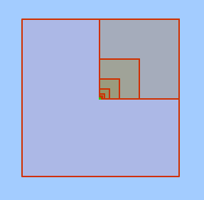
Rather than using CBGs that partition the US by population density, what if we could partition the US ourselves based on commercial density. The idea Eric Buth and I came up with was one that utilized Google's S2 Cell library. S2 cells are a great technological innovation because they are a useful for making spacial indexes that speed up point level databases and for approximating regions as a collection of cells.
The algorithm goes as follows: Starting with the s2 cell that fully covers the US, recursively divide each cell into 4 equal sub-cells if it has more than X number of stores in it. If the cell has fewer than X stores, leave the cell as is. Once the recurssion is done, we will have an S2 covering of the nation where every cell has fewer than X stores. Next, we can remove all computed cells with fewer than Y stores in order to get rid of the areas that have little to no commercial activity. Now, each computed S2 cell has a roughly equal commercial density value between X and Y and can be used in a classification model like the one in FIT. This algorithm helps to break down extremely dense commercial areas to get much more granular recommendations.

Adaptive cell covering in Chicago
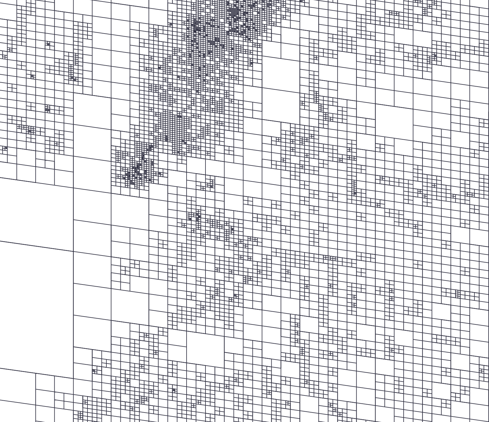
Adaptive cell covering in New York City
Other Uses For Adaptive S2 Coverings
This adaptive s2 cell covering algorithm can be used for all sorts of modeling exersizes where regions should be defined by discrete points. An example of this would be defining regions by mobile phone geolocation pings to generate regions normalized by daytime population rather than residential population. This could be used to figure out the best place to put up a billboard for example. Alternatively, you could use this algorithm to generate geolocation predictions for photographs or social media posts. Computing regions with the same number of hospitals, schools, or subways in them may also prove useful in a urban planning function.
One reason for why this normalization technique might not be useful is if census data also needs to be taken into account. If, for example, you had zipcode-level data that you wanted to use in your model, that data would have to be disaggregated into the new cell regions that were created. While there are certainly way to do this, it definitely presents a very real challenge.
4) COVID-19 University Tracker
Roles: Product Design & Front-End Development // Collaborators: Samuel Coxon, Mahir Yavuz


This is a prototype I designed and built for Samsung in order to track COVID-19 cases in universities. The app has three different pages:
Nationwide page: Meant for tracking where students are traveling to and from around the nation. This is visualized using an arc map — each arc is colored and scaled based on both the number of students traveling and how risky the place they are traveling to/from is.
Citywide page: Meant for tracking where students live around the city and overlaying that with zipcode-level COVID-19 data.
Campuswide page: Meant for tracking COVID-19 on campus — where the people who are infected are quarantining, where the testing sites are, where buildings that don't have proper ventilation are, where the classrooms that haven't been sanitized yet are, and more.
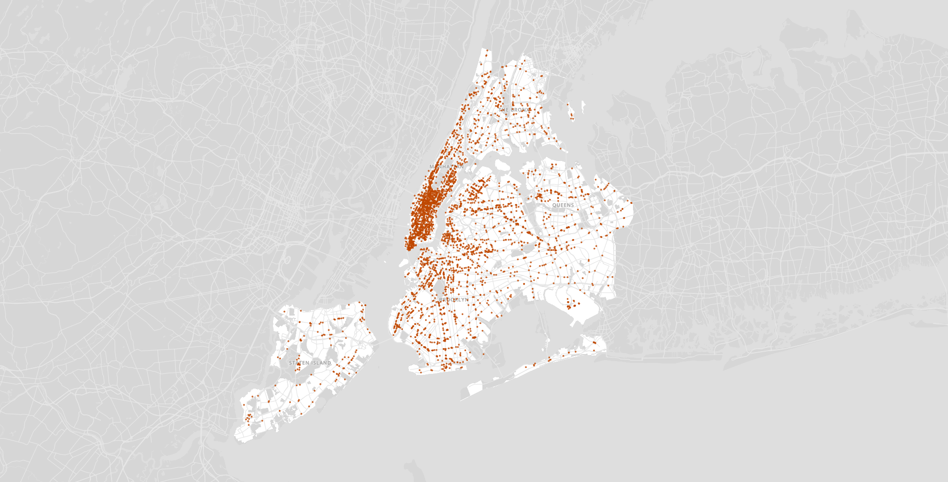
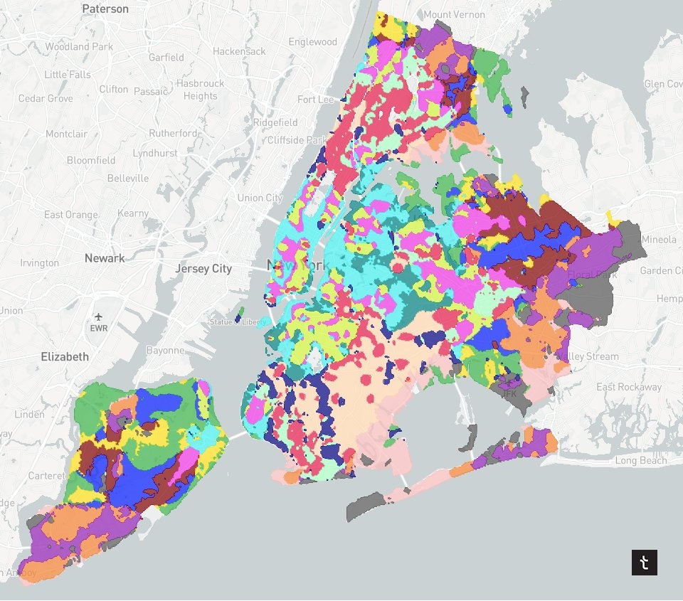
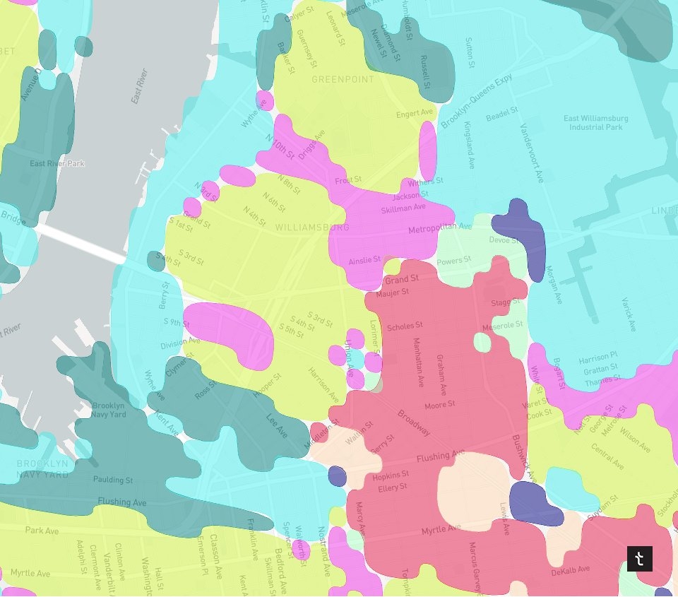
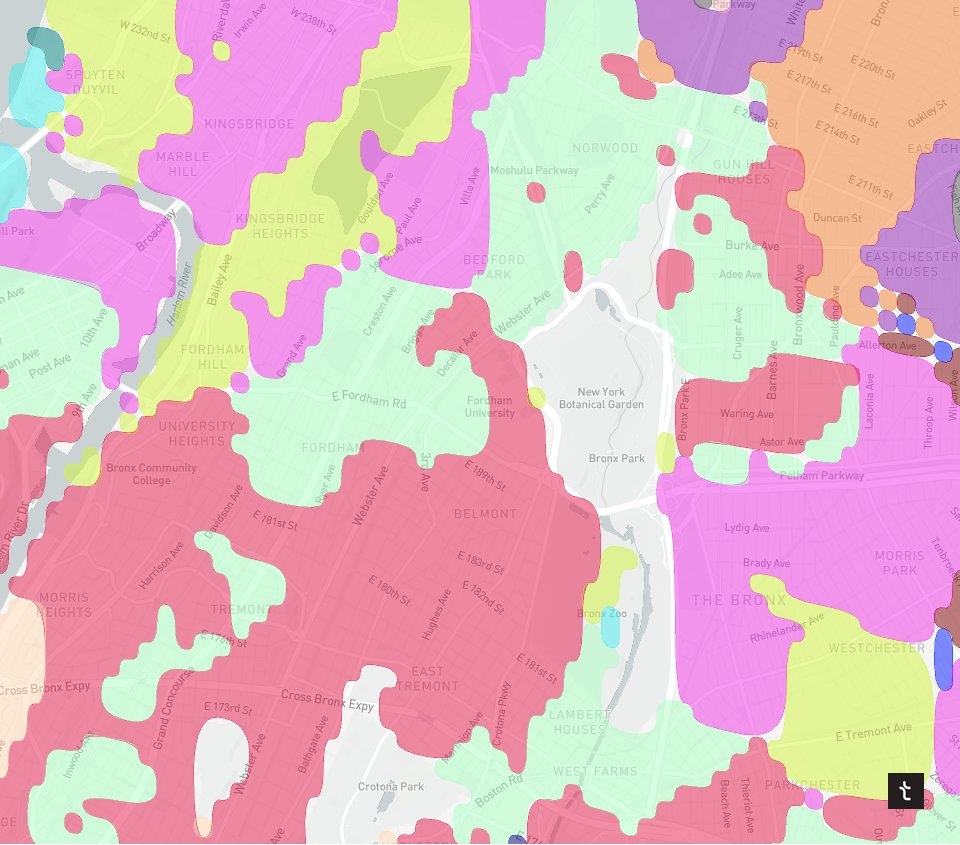
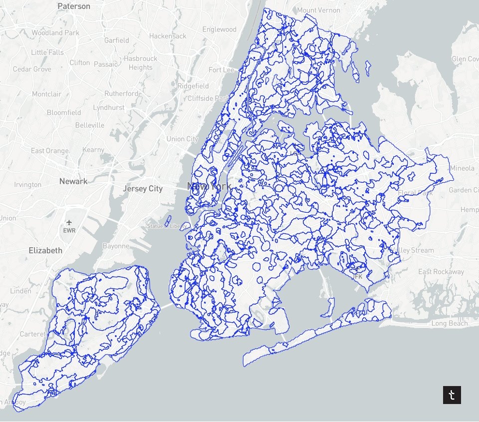
5) Micro-neighborhoods of NYC
Roles: Data Science & Data Visualization // Collaborators: Mahir Yavuz
Breaking down NYC neighborhoods by clustering S2 cells based on their distances to multiple points of interest. The output is a new map with much more granular NYC neighborhoods. This work was the inspiration for a lot of future work at Topos.
6) Explore
Roles: Product Design & Front-End Development // Collaborators: Eric Buth, Mahir Yavuz, Will Shapiro
This is an app I designed and built using React, D3, Mapbox, and Turf.js in order to explain and visualize hundreds of thousands of census-derived metrics in a multitude of ways. The app consisted of five pages:
- Feature Explorer: Exploring zipcode census data in all the major cities in the US.
- Neighborhood Explorer: Exploring all of the census metrics for one specific zipcode.
- Address Report: Getting census, transit, traffic, and POI data about a specific address
- Similarities: Finding the most similar zipcodes between cities based on a different types of metrics. I.e. showing the most similar zipcodes to Williamsburg in Austin, Texas.
- Clusters: Grouping a city's zipcodes by how similar they are to each other.


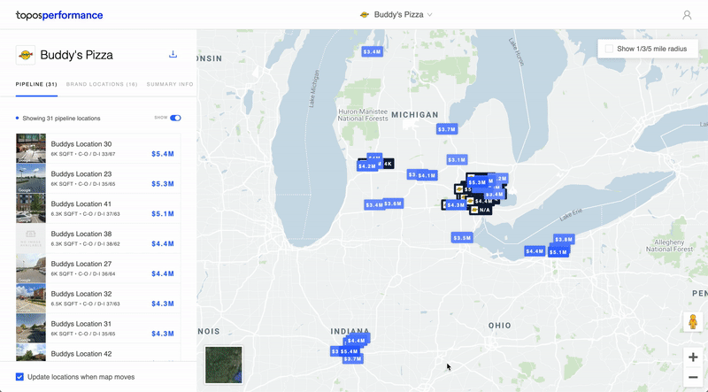
7) Performance
Roles: Product Design & Front-End Development // Collaborators: Carlo Bailey, Mahir Yavuz, Ria McIlwraith
This is an app I designed and built meant to provide businesses with address-level revenue predictions for prospective store locations. By inputting existing store revenue data, a client could get revenue predictions for a set of new addresses.

8) Behavery
Roles: Product Design
Behavery is a platform made for running and crowd sourcing online experiments. I was tasked with fully redesigning the existing app in order to make it more user-friendly and visually appealing. This work was really my first exposure to any sort of product design or development.


9) Graphic Design Projects
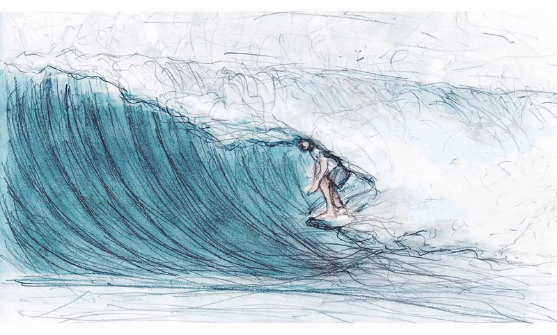
Hand-Drawn Surfer Animation