Back to all work
[x] Everywhere
November 16, 2017
An art project meant to ask the question — What does distance mean in the 21st century? [x] Everywhere is a visual (and arguably insane) way to explore neighborhood similarities.

What makes one neighborhood similar to another?
Have you ever been walking around a city or neighorhood and thought to yourself, "this place really reminds me of [x]". Personally, I have always felt that Mexico City, the city I grew up in, feels extremely similar in pace and culture to Istanbul, the city my dad grew up in.
I have also had that same feeling with certain neighborhoods in New York City. Williamsburg is New York's version of Mexico City's Condesa. Greenpoint feels a lot like Roma to me. The Upper East Side could be described as the American version of Polanco.
So, what is it that makes places feel similar to each other? Is it how they look? The people that live there? How easy they are to navigate? The types of businesses in the area? Vegan restaurants vs fast food chains?

[x] Everywhere brings similar places together using the Topos Similarity Index
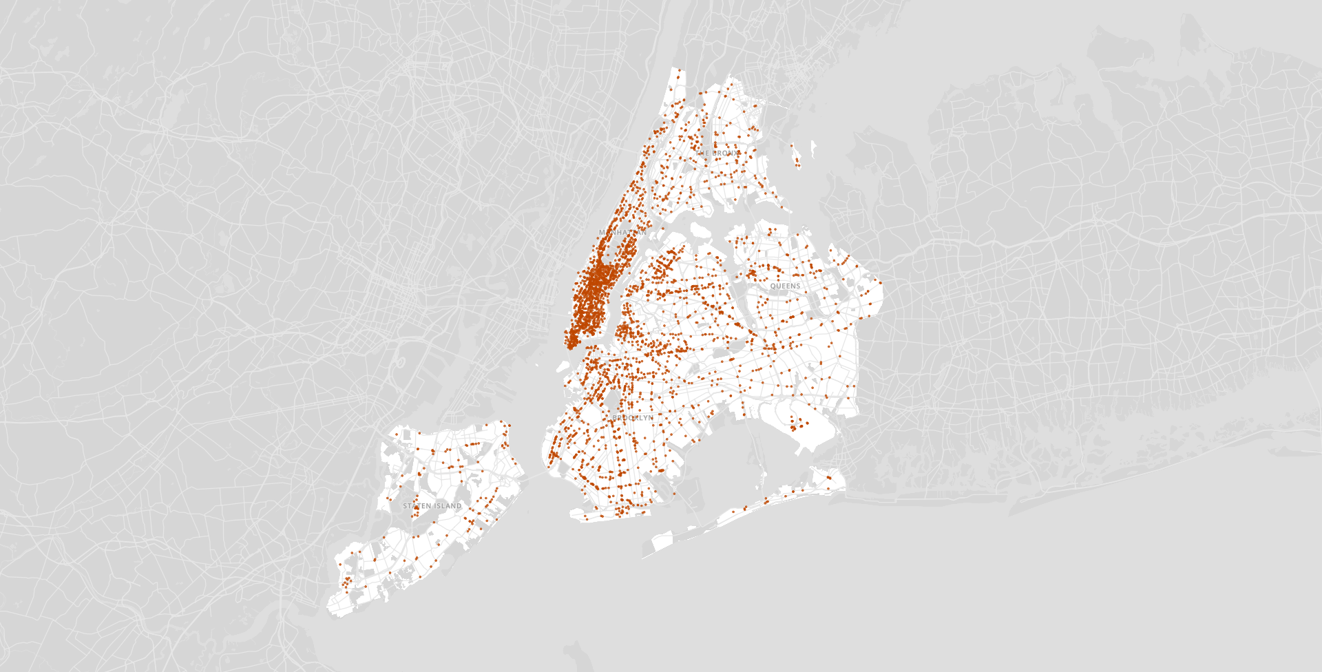
Whether its the walkability, weather, or music scene, places feel similar to us for tons of different reasons. The Topos Similarity Index was built to try to encompass all of these factors as an attempt to quantify how similar two places really are. Encompassing everything from topological analysis of urban form to the ratio of third-to-first wave coffee shops, the Topos Similarity Index takes 50+ heterogeneous data sources, transforms them using a wide range of technological approaches (Natural Language Processing, Computer Vision, Topological Data Analysis, …) and integrates these inputs into a single normalized similarity metric. The computation of similarity scores between neighborhoods across the US led to this art project.
My task was to come up with a way to promote the TSI. After iterating through a multitude of ideas, I was inspired by the question: what does distance mean in the 21st century?
As taken from the article "Rethinking ‘distance’ in New York City", "At some point in history, geographical proximity may have implied cultural proximity, but this is increasingly being called into question, as can be seen in everything from voting patterns to the distribution of third-wave coffee shops across the United States. We intuitively felt that Bushwick, Brooklyn has more to do with Silver Lake, Los Angeles than any neighborhood in Albany, New York despite the 3000 miles in between."
The advances in technology and globalization of the 21st century means that geographic closeness no longer implies cultural closeness. But, what if it did? That's the idea behind [x] Everywhere — what if the most similar neighborhoods were also the closest geographically?
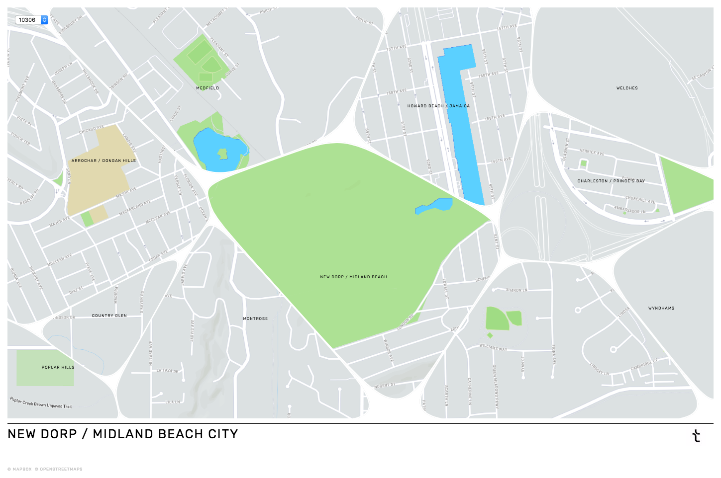
The making of [x] Everywhere
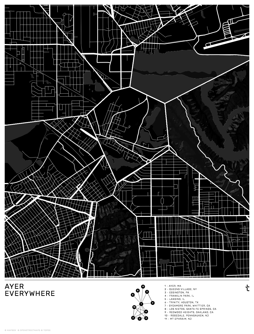
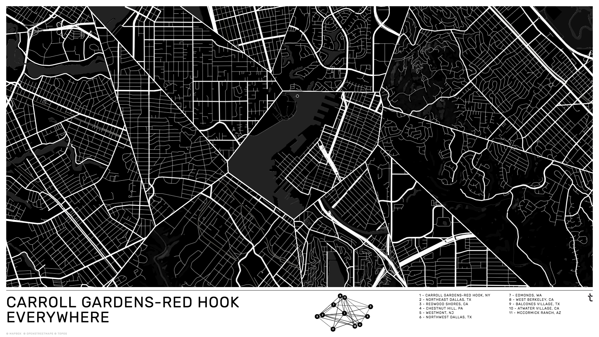
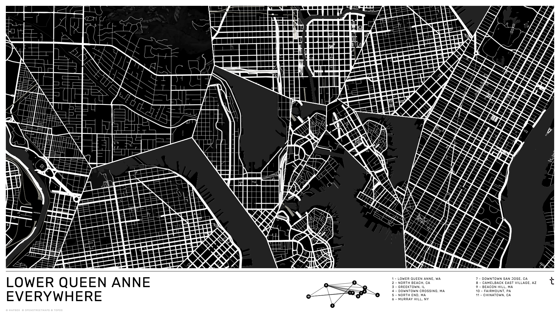
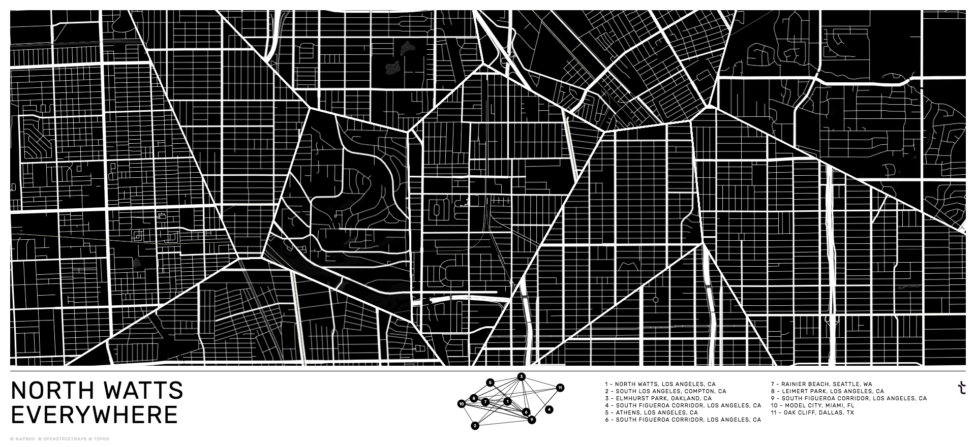
The general idea for the project was to construct a brand new city map using pieces of maps from different places. The TSI covered 1,718 different zipcodes, so the plan was to build 1,718 different unique maps.
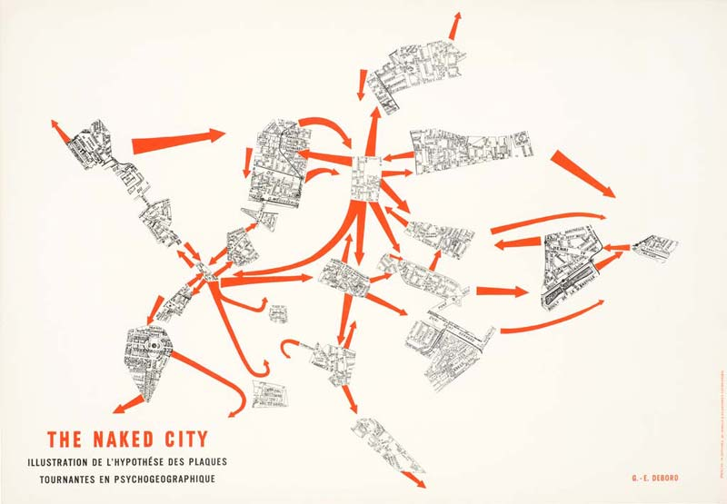
This idea was inspired by a diverse set of projects, ranging from The Naked City (Guy Debord) to *Where is Williamsburg *(Kate Ray). Most importantly though, I felt like a lot of city maps already look like disjointed puzzle pieces! Looking at a street map of Los Angeles, the major throughways break apart the city in a way that makes it look a little bit like a voronoi.

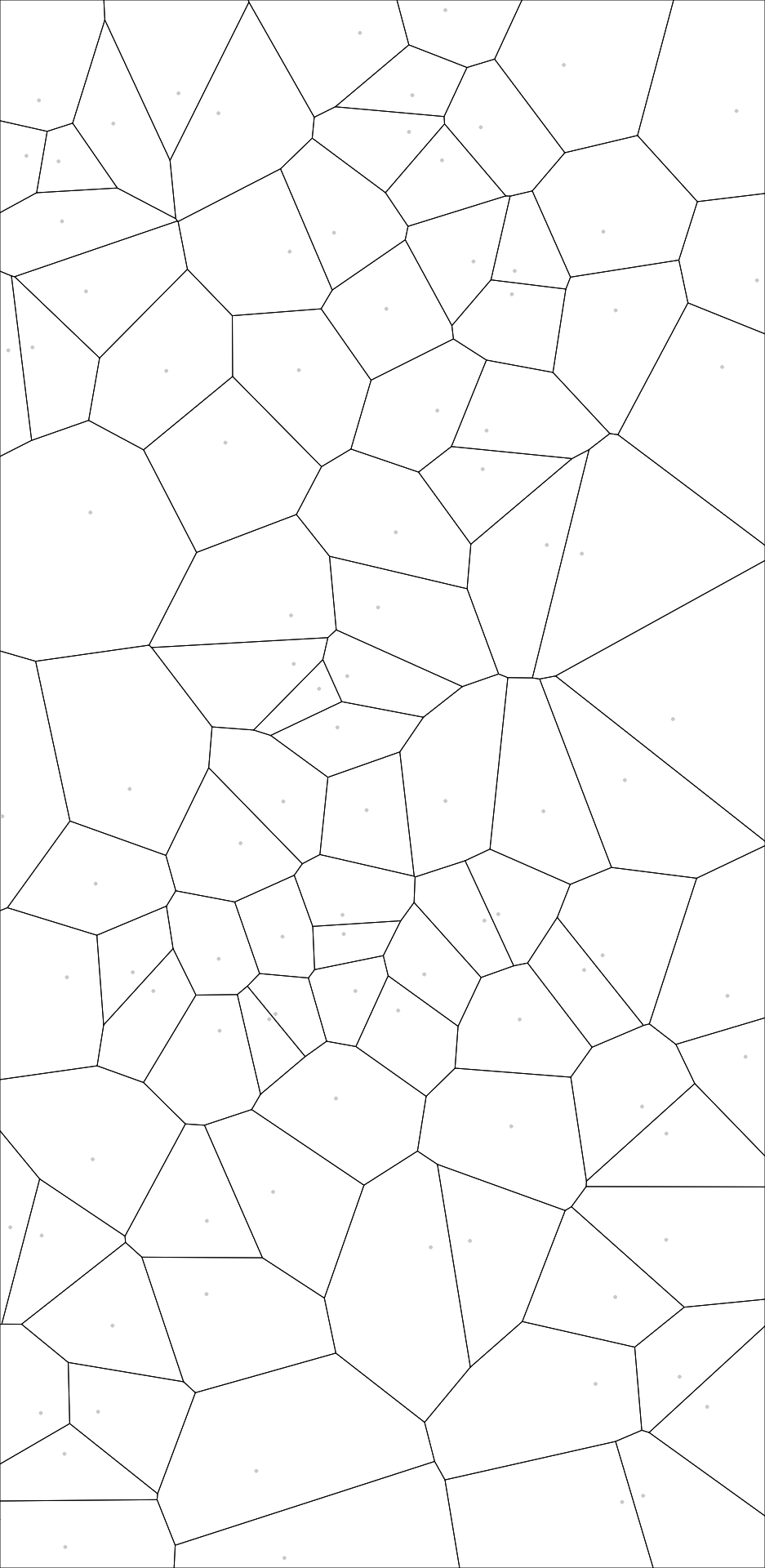
Voronoi Maps
For a given neighborhood N of the 1,718 neighborhoods in the TSI, the plan was to build a new city map by essentially fitting together the map of N with the maps of its ten most similar neighborhoods. To do this, we decided to use voronois. After I came up with this idea, Mahir Yavuz and I worked on actually building the maps.
For each neighborhood N in the TSI we had to:
Get its top 10 most similar neighborhoods from the Topos Similarity Index.
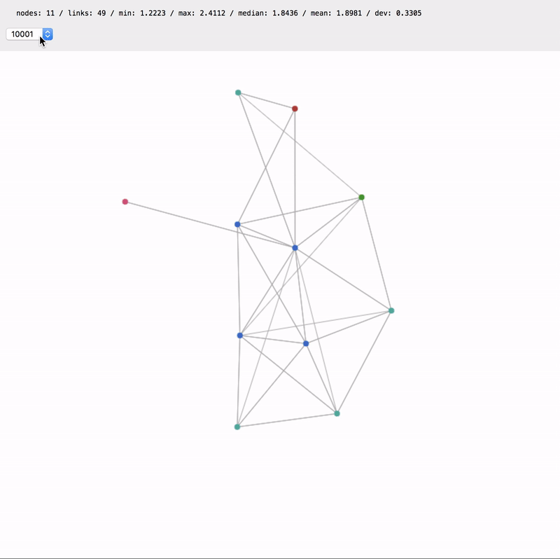
Create a similarity network with the 11 neighborhoods, where each node represents a single neighborhood and each edge represents the similarity between two neighborhoods. Edges with a higher similarity score should pull nodes closer together. Finally, force the node for the selected neigborhood N into the center of the network.
Generate a D3 voronoi using the node positions in the network as its initial set of points.
Load 11 different mapbox maps (one for each neighborhood) in the shadow-dom. Set the maps to an appropriate zoom level.
Copy all the contents of each neighborhood's mapbox canvas to a new canvas of the exact width and height of its corresponding voronoi bubble.
Add the 11 new map canvas images into the D3 voronoi and clip the edges so as to not overflow past each voronoi bubble.
Style the voronoi edges to look like streets.
Repeat process for multiple screen aspect ratios.
Getting all this to work required a lot of tedius work, but here is the output: