Back to all work
The COVID-19 Compiler
May 18, 2020
Company: Topos
Collaborators: Sam Coxon, Ria McIlwraith, Eric Buth, Ellery Royston, Sam Burns, Carlo Bailey, Mahir Yavuz, Bo Han
Roles: product design, front end development, data visualization
In this post, I’ll talk about how I helped build one of the first publically available visualization tools released to try to understand COVID-19. This app was meant to provide a multidimensional view of COVID-19’s impact in counties across the US. It encompasses the mapping of vulnerable populations, state and local policies to reduce transmission, and data on medical / health care resources. The COVID-19 Compiler has been featured extensively on the Rachel Maddow Show.


Around mid March, as the COVID-19 pandemic was taking hold of the United States, there weren’t many tools out there painting a clear and accurate picture of the situation. The federal government wasn’t releasing anything useful and was instead actively promoting misinformation. There was a lack of federal enforcement on state reporting, which meant there was a huge variation in available state-level data. The racial and ethnic breakdown of cases and deaths was often left unreported, the geographic unit for reported data would range from zip codes in some states to counties in others, viral and antibody tests were sometimes reported as a single figure rather than two, and states would often retroactively change their numbers. On top of that, the data itself was difficult to find, access, and understand.
In making the COVID-19 Compiler, we were mainly focused on three goals: (1) creating an experience that allowed for non-experts to understand the impact of the virus nationwide. (2) Exposing and spreading awareness about specific locations and communities that were highly vulnerable or compromised by the virus. (3) Creating an up-to-date resource for tracking the virus in specific regions or counties.
Once we released the Compiler, it quickly caught on and was picked up by The Rachel Maddow Show. From the exposure that the Compiler got on MSNBC, our site’s active user base grew to the hundreds of thousands at its peak.
My Role
The role I played in building the COVID-19 Compiler was as the lead front-end developer. This app was built with React, along with Deck.GL for the map and D3 for all the charts and for the geospatial and mathematical calculations. I also designed the region search experience, the correlations tab, and helped design the main bivariate map.
Exposing Vulnerability With Overlaid Data
The lack of any real breakdowns in county and state level COVID-19 data made it practically impossible to make any true assessments about the extent of the virus’s impact on marginalized communities. It is impossible to know how many black people have gotten COVID-19, how people who died from COVID-19 also had pneumonia, or how many of those hospitalized were living under the povery line. While these questions are still unanswerable, I came up with the idea of overlaying COVID-19 data with multiple other datasets as an attempt to answer these questions.


COVID-19 Cases Per Capita vs. Hospital Beds Per Captia
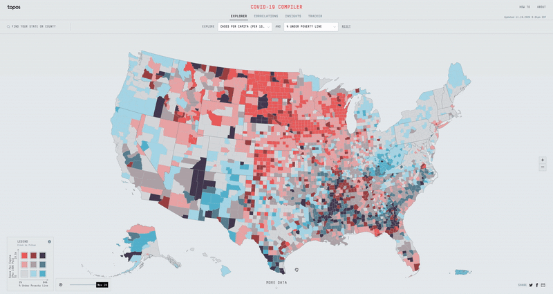
One example for how overlaying data can be useful is, if we use the COVID-19 cases per capita dataset and overplay it with the hospital beds per capita dataset, we can easily find the counties that have too many cases for their hospital system to handle. We can do the same with total number of hospitals, median household distance to nearest hospital, ICU beds per capita, etc.


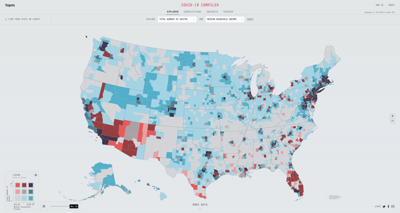
If instead we overlay the Total Number of Deaths dataset with the Total Population dataset, we can try to determine why certain counties with low population numbers have the highest number of deaths. When we see that the Navajo County in Arizona, San Jan County in New Mexico, and McKinley County in New Mexico all have some of the highest total COVID-19 deaths with low total populations, we might then find that all three also have some of the highest % of American Indian or Alaskan Population in the country. While the actual impact COVID-19 is having on the American Indian communities in Arizona and New Mexico isn’t explicitly expressed in the data, the Compiler helps expose a potential vulnerability.
Making the App
With over 50+ different metrics to overlay data with, I had to build an experience that was fast, efficient, and easy to use. Displaying two separate datasets on top of each other can get pretty messy, so I opted for a nine bucket color scheme. If we split all the different datasets into three buckets (low, mid & high), then the nine bucket color scheme is simply the combination of two datasets (low-low, low-mid, low-high, mid-low, mid-mid, mid-high, high-low, high-mid & high-high). Using D3 Scale Cluster I was able to compute these buckets on the fly for all our data.
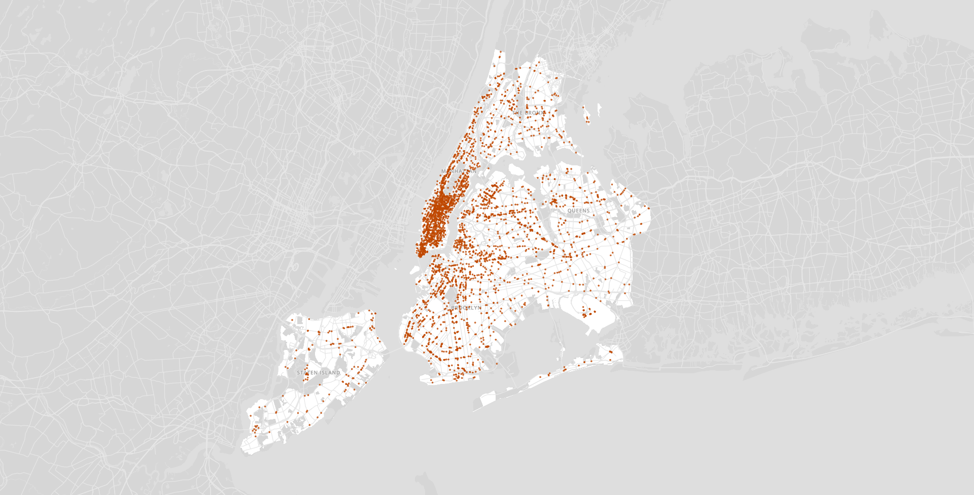
I built a map using canvas and GL technologies that would allow for rendering a heavy amount of data and filtering it instantly. I chose an orthographic projection for the map so that it didn’t skew the size of the counties as a regular mercator map might. In order to load and display all the county data for the entire US, I generated a county-level TopoJson and heavily simplified the lines. Finally I made a legend using D3 and added the ability to filter the map on click and hover.
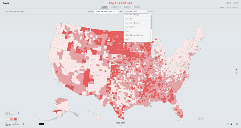
While the Compiler can be pretty powerful for a user like an urban planner or a health expert, we also wanted to make it a useful experience for regular people concerned about the virus.
The Region Search
In order to help people easily find the data for a specific region, I added in a slick region search that allows one to select any combination of states, divisions, or counties. In addition to animating into the selected regions, I built in functionality to be able to re-normalize and re-bucket the data based on the selection. In other words, this allows me to see how Miami Dade County is doing compared to the rest of Florida rather than the rest of the US.
The List View
Additionally, I built the List View, which consolidates all of the COVID-19 data for all the selected regions. This allows me to easily search for aggregated COVID-19 data for the Tri-state area for example. I handled all of these regional calculations on the Front-end per request.
These two features were big hits, as we received lots of feedback about how useful it was to be able to find accurate information about the places people cared about.
Correlations

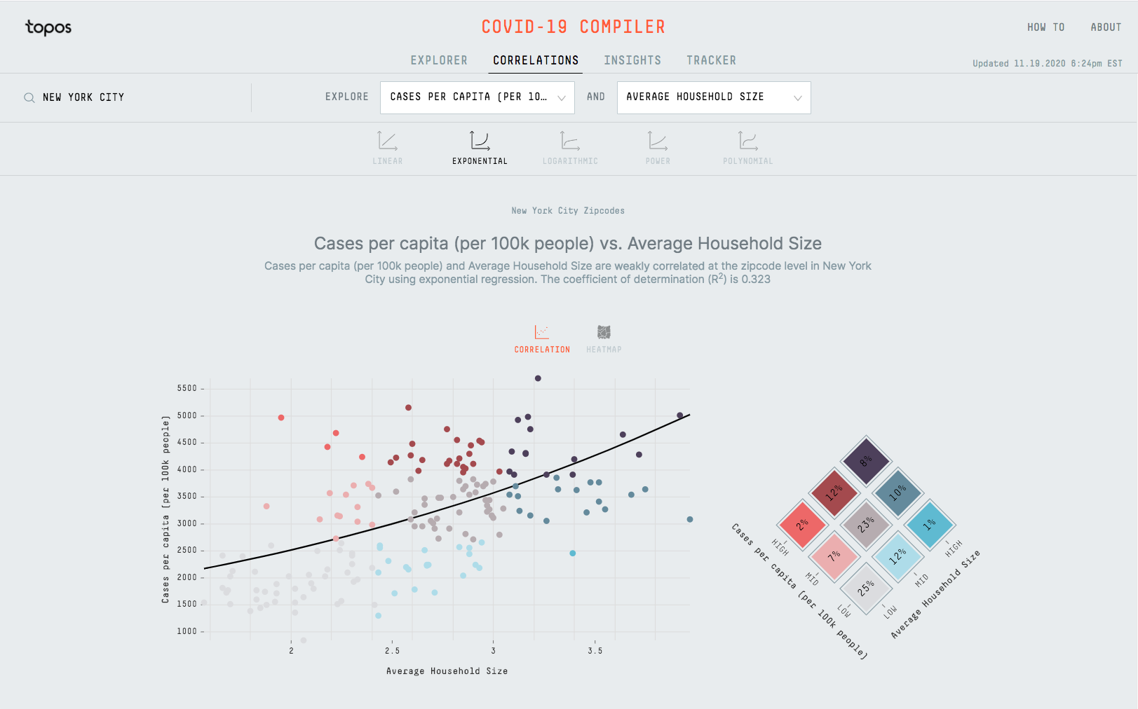
In addition to the main map view, I also built a page that displays all the combinations of metrics in the system and sorts them by how correlated they are. This page shows how the average household size for New York City zip codes is positively correlated with Cases per capita. We can also find that deaths per capita is positively correlated with % of people who don’t own a computer.
Takeaways
The COVID-19 Compiler presented a unique challenge for me. I was forced to quickly learn all about the epidemiology of the virus, build an app capable of handling hundreds of thousands of users at a time, keep pace with organizations like the New York Times and MSNBC to avoid falling behind, and all the while having to do this working from home.
Working at an extreme pace and working from home without direct access to my coworkers was difficult. In the end however, it made me a more efficient coder, a more independent learner, a more responsible manager, and a more effective communicator. While I’m extremely proud of the work I did to build the Compiler and the impact it had on all our users in the misinformation age, I’m somehow even prouder of my ability to accomplish all this in the crazy circumstances we found ourselves in.
The Covid Compiler can be accessed at https://covid19.topos.com. The data is up to date but the code is not currently being maintained.